Designing My Fabric Collection: Handloom
Designing Handloom was such a fun process. In past lives, I have designed/selected colors for Michael Miller Solids and designed shot cottons for Windham for their Artisan Cotton line. So this is a project dear to my heart- creating the colors I want to see out in the world!

Handloom is like a shot cotton, in that it is a woven fabric with two different colors of fiber, one in the warp and one in the weft (which goes right to left, if ever you cared to remember). These types of fabrics are the closest you can get to mixing paint when design a fabric because the two fibers blend together visually.
The thing that made designing Handloom different than a shot cotton is that not only did I get to design the color combinations, but I also got to choose the base cloth and the fabric texture!
When we first started developing the collection, the mill sent me a brushed sample and once I washed it, the two sides of the fabric behaved differently. Because I really wanted this to behave like a solid (no clear right and wrong side) and because I couldn't tell the difference between the two sides until I washed them (how the heck would the non-prewashers tell the difference?!), I went with a different weave, and had them send me a few more fabric weights to test.
So the mill sent me multiple fabric weights to test. Some samples were too thin and frayed more than I wanted, which I knew we all would NOT love.
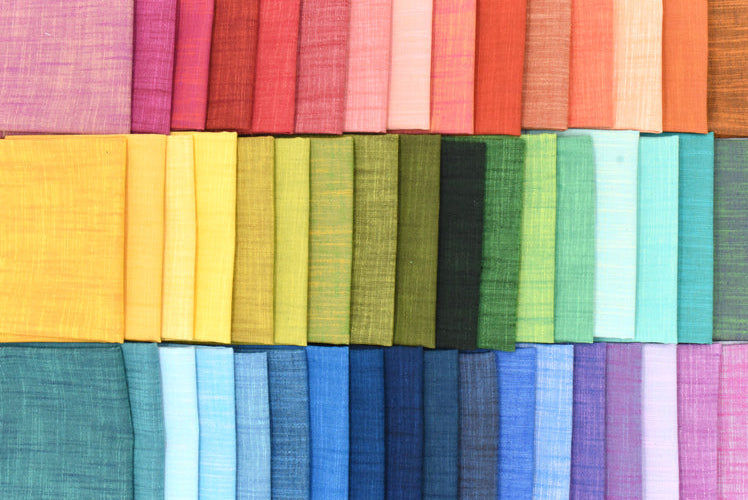
Eventually I landed on a slightly thicker woven and once I washed it, I completely fell in love with it. It has this lovely textured surface where some threads are slightly thicker than others and the two woven colors created so much visual depth.

After we settled on the base cloth, next up was my favorite part - designing the colors!! And we also know that because it's me, I mixed together some funky colors along with the easy ones.
The way the process works is I tell the mill which colors to weave together. I send them a paper with little color swatches taped down, doing my best to imagine what those two fibers will visually create once they blend together. Sometimes the combinations are fairly intuitive and sometimes they are really unexpected, like a dark blue woven with a light green suddenly becoming this vibrant color with so much depth. Then the mill sends back little woven strike-off samples of the actual fabrics. We also sent some colors back to be rewoven (see picture below), as the combinations weren't quite what we wanted. Overall, I probably got back around 200 colors and while the original plan was for the collection to include 35 colors, I somehow talked the owner of Windham up to 65 (I was rooting for a nice even 100)! He still has not answered me about when we can add more 😂.

I worked with one of the designers at Windham to narrow it all down, and luckily she and I have the same color tastes too. We like the weird stuff...but we also wanted a well rounded collection, so added in colors I might not use personally, but made for a great color wheel palette. And of course I looked at the range of values and made sure we had a nice spread there too.
But all in all it was so hard to å narrow the colors down!!! They were all gorgeous!!
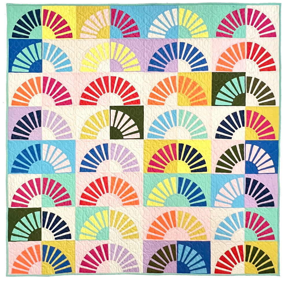
I think Handloom shines the most when it is mixed into a stash with everything else. I love pairing it with smooth solids because the texture and woven color shifts really stand out against them. It adds this extra layer of depth and movement to quilts that I am completely obsessed with right now.
I hope you enjoy this new collection as much as I do! It will be available in my shop starting June 25th, 2026!